Thursday, March 29, 2012

Crunch Time

There are only a few more days until major things need to be done and turned in to the gallery. Right now I am in the process of revising my map so that I can get it into printing. After that, I will finish drawing my faces, put them up, take the pictures and print those. I know this is a lot to do, but I figure since I have the frames I am going to use, I can give these to the gallery as place holders on Tuesday. I am hoping to get as much done as possible this weekend though. It is really frustrating, because I have another class project which is a site installation and there is going to be an opening of that next Wednesday, so my professor is being especially naggy and making us all work really hard up until the opening. Then, on top of that, some personal problems arose the past few days. Not trying to make any excuses, but if I look like I want to punch anyone in the face in the next week or so, this is why.

What I Did:

5 hours revising my map
15 hours drawing facial features
1.5 hours planning gallery set-up
2 hours getting frames from Ikea


first love face

eyes for first crappy apartment face

4 AM face (the eyebrows are underneath the eyes because I ran out of room, but I'm cutting everything out anyway)

sketches for gallery space


What I Discovered/Encountered:

Even though I liked how my card looked that I made last week, it didn't have the right feel for my project. I agree with Hannah that it looked like a different project. I could have gone in the direction of making faces in Illustrator, but I didn't so I needed a new look for my card. I still like the way the card opens up to reveal the inside of the mouth, but we came up with a new way to fold it that makes that a little more apparent. Therefore, I need to draw a mouth, but I want it to work in almost the same way as the previous design, it just would have a different feel because it is hand drawn. Then, the way the stack of cards are going to be placed in the gallery, they are going to pair up with the eyes that are going to be above them. Together they will make up my final worried face, which will be included in my map.

I went to Kolossos, and they seem to have the cheapest prices and the best quality for what I want to do. The price, however, is way more than I intended: $300 for 500 cards. I might have to bring that number down to 400 and fold the cards myself, because I do not have that kind of money to spend, even if I want to make a good impression for my show. There is even a special that the owner gave me, and this is still the price. It's crazy. 

Drawing the facial features that I will paste out in public has been going smoothly. It is my favorite part of this whole process. I can get immersed in them and not even realize that so much time has gone by.

What I Plan To Do Next:

I will draw the mouth for my card and send in my design to get my cards printed at Kolossos this weekend. I will then finish up drawing my faces and try to put them up before Tuesday. I don't think putting them up that soon will be possible, but I will try. I have a lot of motivation now that I am hoping will push me to get as much done as a can these next few days.

Thursday, March 22, 2012

time to start making

I know where I want to have my pieces installed and I know how I want to transform the spaces with the faces I want to make. I know the kind of map I want and what I want it to look like. I know how I want my gallery space to look also. Now that I know everything that I want to do, it's time to start making.


What I Did:

3 hours planning out last site
15 hours revising map/card, getting information on printing
3 hour trying to get permission for various sites
2 hours measuring sites to know how big to draw the faces

the front cover

inside

back cover


What I Encountered/Discovered:

Things are going well, but I am realizing it's crunch time and I am going to have to kick it into high gear if I want to get everything done. But that's okay, because I work better under pressure. It was nice to get feedback from Stephanie and Juliet about the faces in my sites. I think there are a lot of valuable ideas that I can use to tweak faces, but I am not doing anything too drastically different from what I have planned.

I was very upset to hear back from the community center manager that I could not use the gate in East Quad, because I was not a resident there. They seemed up for it at first, but regulations say because I am not a resident, I can't do it. I think that's kind of bullshit, because what I would be doing wouldn't affect anybody or anything and East Quad is usually an artsy place. I wish I would have just done it without permission... but now they have my information. It makes me wonder if I should try to get permission for any of my projects...? I got permission for the one on the exterior wall of my studio, however.

Hannah gave me some good advice for my map and for my gallery space. Incorporating one of my faces onto the wall of the gallery and possibly interacting with the pictures is something (for some reason) I had not thought of before. I always figured the only option I had to putting a face in the gallery was to bring a structure in to transform. I went to Mark about this new idea, though, and he said it would be fine. After all, this project has brought up extreme emotions for me, and I will definitely remember the stress it brought upon me. So a huge stressed out face could be a perfect addition to my project.

As for the map, I had previously thought that I wanted an 8.5"x5.5" postcard, because I wanted it to be more intimate than a big fold-out map. I designed the postcard to what I thought had been personalized to my project, but it still seemed a little generic. The idea was presented that I incorporate one of my faces into the map, and to possibly make it more like a folded card, with the front having a face so that people want to take it, but the interior being the map and the important information. This makes it more intimate yet, and I like this idea.

I really like how the map/card will work how I designed it. The front will be the top of the face. The card will then open like the mouth is opening to reveal the inside, which has the sides of the lips going down the side. Then the back cover is the lower lips.  I like how the face looks right now, but I am wondering if I need to make it look more hand-drawn. I could add some more detail in Illustrator, or I could just draw it and scan it in, but I am not sure if it is necessary for the face on the card to look exactly like all my pieces.

What I Will Do Next:

I am going to Ikea this weekend to get frames for the 7 photos, and I need to start making the faces as soon as possible. I need to test them out to see if they look exactly as I want them to. I am also going to Kinkos and calling Vistaprint to ask specific questions about the printing of the card/map.

Thursday, March 8, 2012

My own emotions

What I Did: 

5 hours revising my thesis paper
6 hours remembering exact emotions from the 7 moments I am going to capture and sketching out how my face might have looked
1 hour taking more pictures of the sites
3 hours researching artists that draw self portraits that contain a lot of emotion and graffiti on brick walls
4 hours beginning to plan face in East Quad courtyard


What I Encountered/Discovered:

Before I got started on the planning of the faces in the different locations, I wanted to make sure I knew exactly what emotions I wanted to convey in each one. They need to be very true and personal emotions for me, and I do not want them to be so generic. That's why I took a long time writing down a bunch of words that described each period of time and then sketched my facial expressions according to those words.

Then I looked up some artists who do self portraits to see in what ways they convey a lot of emotion.

Dave Kinsey, Scream
I love this painting by Dave Kinsey. The colors are loud, and the distressed look of the black is angry and disturbing. I love how the mouth is the only thing you can see on the man's face. You cannot deny that there is so much emotion in this painting. Even though his style is different from mine, it makes me think about the different colors I can use to express the emotion, and how I don't need to include everything on the face to convey a true emotion. Maybe just a mouth will do.


It is much easier to make faces and characters out of structures that already look like they have parts of a face included in them. I am finding it harder to find structures that I can transform into a face when they have to be in a specific area, especially when I want them to capture a certain emotion and expression. I found some good spots in East Quad courtyard, however, and I liked how I transformed the 3 spots for different reasons. I like the face on the brick wall, because I did not draw on the mortar, which makes the face a little bit more hidden, it looks like it is more integrated into the wall, and it makes the mortar stand out, like it is in front of the face. The first one, I Photoshopped my just my eyes into the wall. It reminds me a lot of JR's faces on walls. After I thought about all of the emotions that I had that day I moved in, I tried to make my face look like I had all of those emotions inside me, and I took a picture of myself, so this is a true personal emotion. I am just not sure if just my eyes can convey all of those emotions. I also went back to my drawings of faces and did two other versions of the brick wall. I tried to use some of the bricks for the teeth in one face, but I don't think I successfully combined them. I really like the face in the gate, because parts of the gate really make up part of a face. It does not have a realistic expression, but it actually does get at the emotion I am trying to convey, which is excitement/nervousness. For this option, I would only need to color parts of the gate, but I do not need to draw anything, unless I wanted to add parts to it. The bench is my least favorite, because I do not like how the eyes are placed on it, but for the mouth, I realized that I could draw the bottom part on the ground, so that you can only see the whole mouth from a certain angle. It could also look like the mouth is opening as you back up.

Before I created the face on the wall, I looked at some ways other artists have used a brick wall as their canvas in creative ways.

I like in this one how the faces are just huge and unavoidable. The detail and colors are fantastic also.

The bike actually juts out of the wall in this piece, which an architect built. Obviously I wouldn't be able to do this with my face, but I was wondering if I could make an illusion that my face would do this.

 I thought this was clever by only using one of the bricks for the art, but it is a very powerful image.

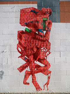
Even though I have not been using patterns in my pieces, I just thought it was an interesting idea that this artist used a brick pattern to create this monster, but it is a different pattern than the brick he placed it on. It stands out a lot, but it uses the site nicely.

What I Plan To Do Next:

Now that I have some ideas that have been planned out and other ideas that are still in progress, I think I can get this ball rolling a little faster and really get into my project. I think I need some feedback on this first location, but I will get to work on planning one or two other locations this weekend.